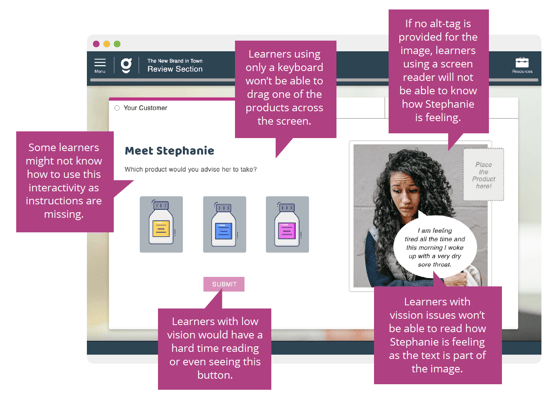
Learning online is an excellent thing for many reasons, one of which is that it allows a lot of people to learn something they otherwise wouldn’t have had access to. With eLearning, you are no longer bound by distance or time difference, transport or even time availability.
But there are still some barriers that can hinder the learning of people with differing abilities.

As someone who designs online learning that everyone should benefit from, you should be invested in knowing how to create learning accessible to people of all abilities.
Here, we’ll take a look at five quick tips for making that a reality.
#1: Empathise with the learner
Perhaps the most effective way to ensure that you are making your online learning accessible is to put yourself in your learners’ position.
Ask yourself questions like:
-
What barriers might my learners face?
-
How can I remove those barriers?
-
How would a screen reader navigate this module?
-
Are my instructions clear?
-
How will my learners engage with various forms of media?
By empathising with your learners, you can provide courses that really cater to their needs and positively impact their learning experience.
#2: Alt text
Images and graphs often provide more than just decoration – they are important to the content itself. These are called non-decorative images. This can cause a big problem for learners who can’t see the images, and that’s where alternative text (alt-text) becomes incredibly helpful.
Alt text should be no longer than 125 characters long while providing a sufficiently detailed description of what is displayed in the image.
#3: Colour contrast
We don’t often think about how physically readable text is apart from its size, but how the colour of the words contrasts the background colour can make a real difference.
By using a free colour contrast checker online, you can be sure that the colours you’re using aren’t making the text less readable and are complying with AA standards.
Similarly, colour alone should never be the sole indication of meaning or purpose in your modules (such as distinguishing correct or incorrect feedback), as some learners may have trouble discerning different hues.
#4: Clear navigation
You want to make the content of your modules easy to navigate, so that the learner can find what they’re looking for without much confusion. One of the best ways to do this is to ensure the titles, headings and subheadings you use are meaningful and relevant to the content and not use the heading text style for anything other than headings.
This way, the learners will know exactly where they are in the course and where to find the content they need.
#5: The right tool
To really make sure your eLearning is accessible, you need to have an authoring tool that supports the requirements of WCAG 2.0.
Guroo Pro is such an authoring tool, as it has these standards built into it so that you don’t need to worry. Get started with Guroo pro now, free!

.png)

