.png)


An important part of making sure that your learners get the best from their courses is maintaining engagement between the learner and their manager, mentor or coach. Ideally, regular contact helps to address any issues or problems that the learner may be experiencing as they undertake their learning, leading to better outcomes and increasing transfer of new skills into the workplace.
Learning data is essential to underpin these discussions between learners and managers. With the right data, a manager can see not just how a learner is progressing through their course, but get deeper insights into the learner’s skills, KPI performance, interactions with the course material and more.
In this blog, we look at six data visualisations that you can employ to inform managers and create the basis of deeper, more relevant conversations with learners.
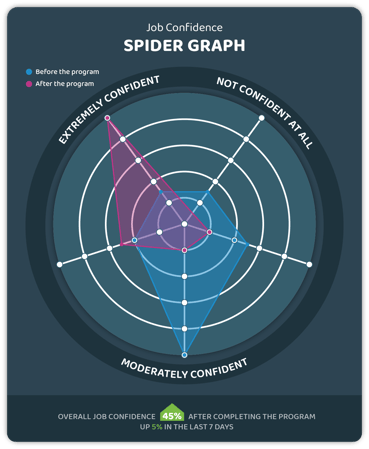
Spider Graph
The impact of a course or module on a learner can’t be measured by completion or performance data. In this example, self-reflective questions within the course encourage the learner to consider their confidence in the areas that the material covers, both before and after completion, and the results are displayed against one another. Tracking this data gives the manager a basis for discussions about the impact of the learning on the learner’s skills and confidence, and on the learner’s attitude to the impact of their course.
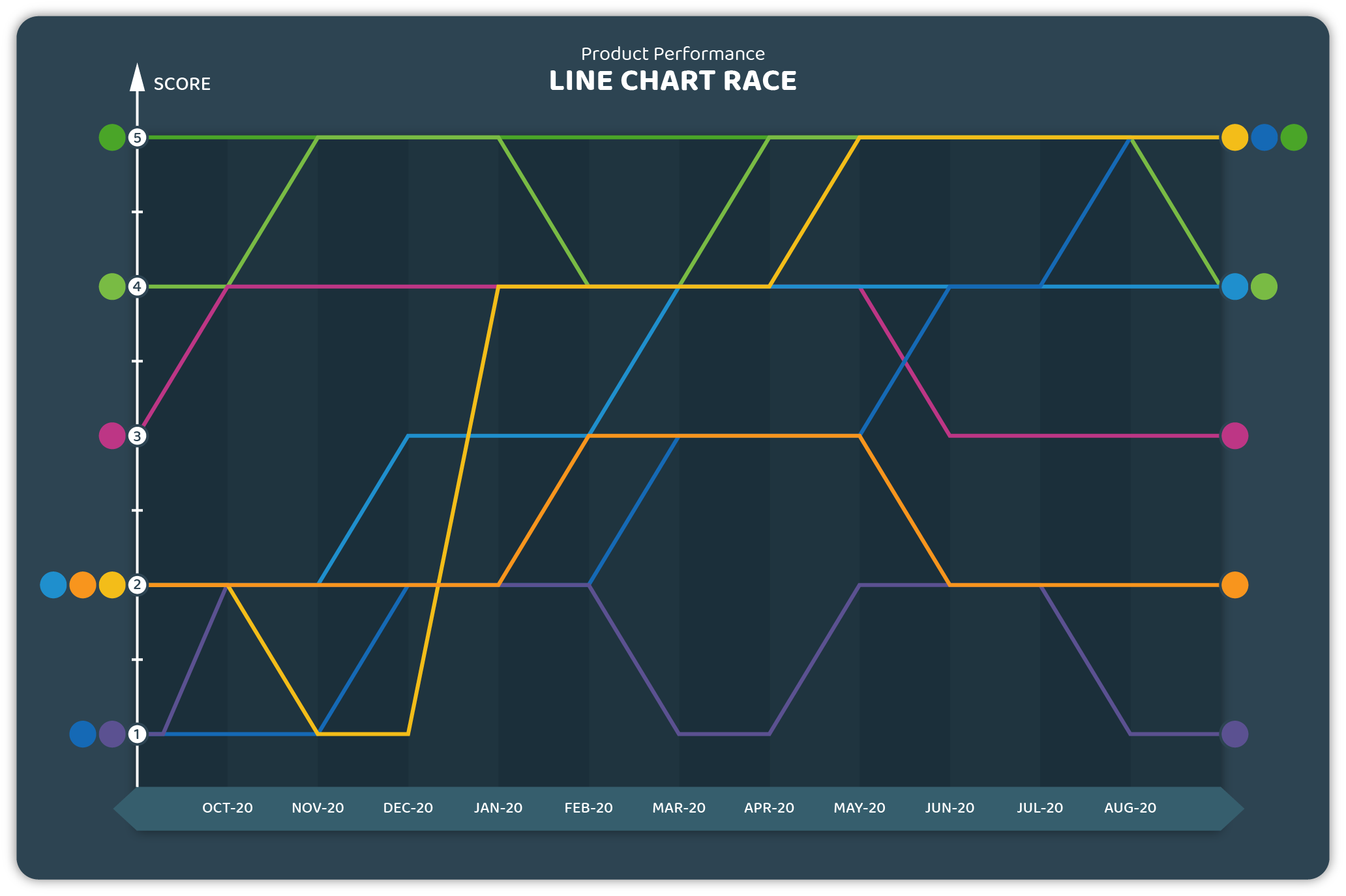
Line Chart Race
The performance of your learners, and of your learning, is not a static thing. Over time differing factors, from changes in your learner’s lives to the impact of organisational initiatives, will affect the performance of your learners and the effectiveness of your learning programs. A line chart race is an ideal way to show the performance of your learners and your courses over time, showing the impact that coaching, mentoring and external factors have on the effectiveness of your learning and highlighting situations where additional support may be required.
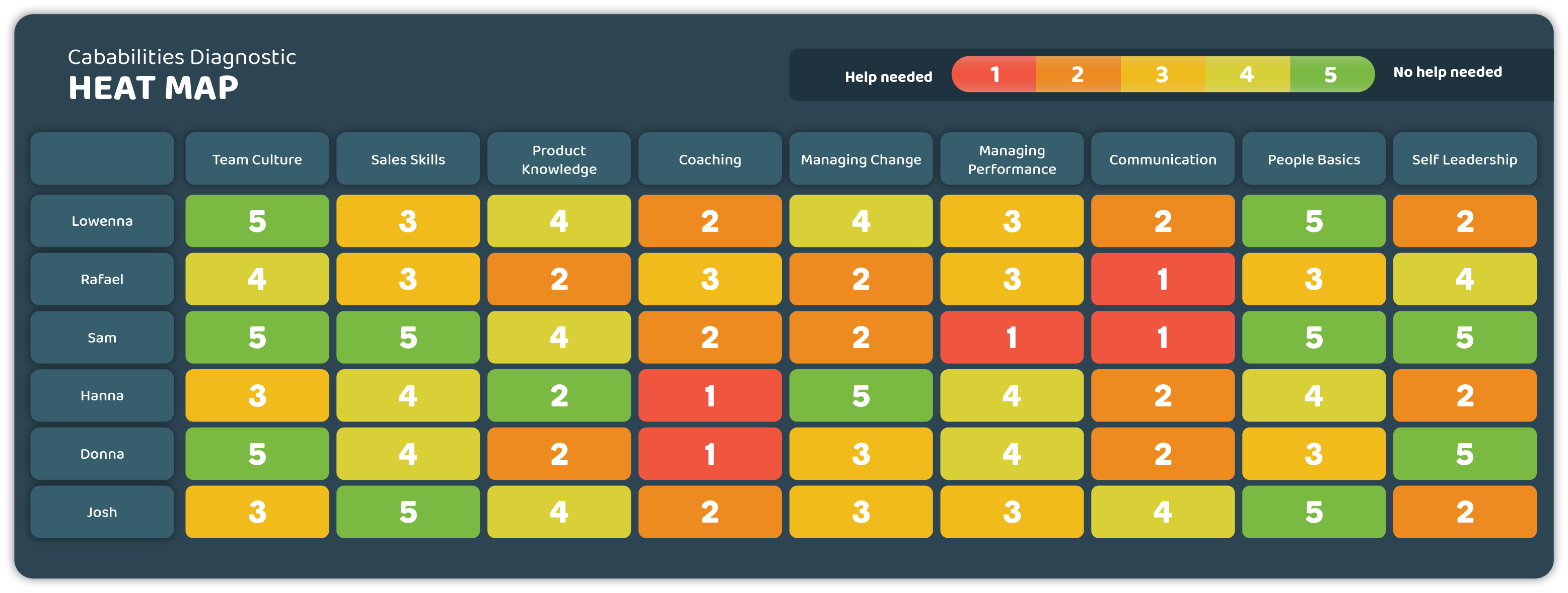
Performance Heat Map
Every learner is different, and each learner’s experiences in their course will be unique. Providing the right support to each learner, and having relevant conversations regarding their needs, requires information on the strengths and weaknesses that each learner has. A heat map lets you easily visualise the performance and capabilities of your learners within their course, letting you identify skills gaps and provide the right support when it is needed.
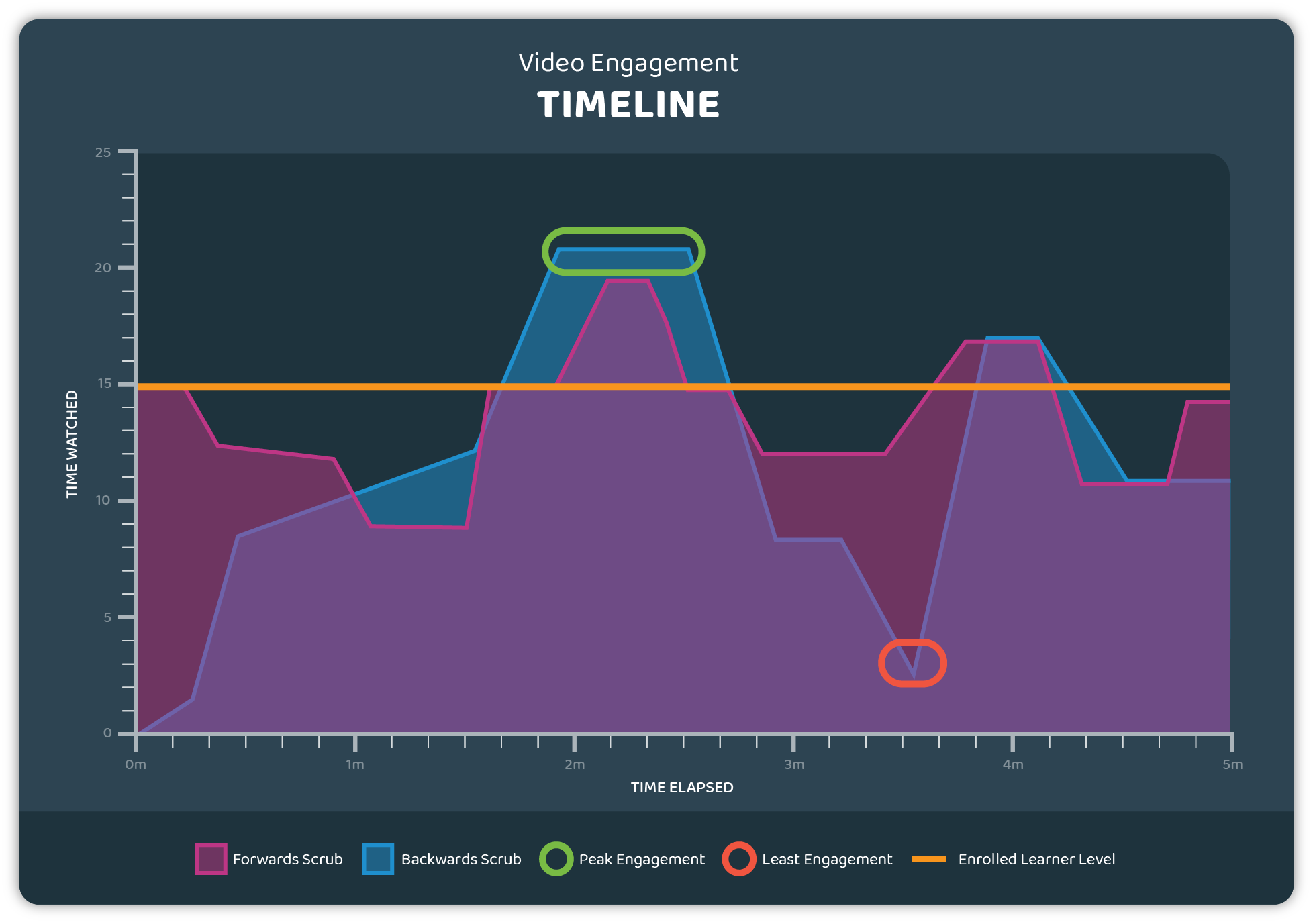
Video Engagement Timeline
Video content remains a significant part of course development and delivery, offering content that can be more engaging and relevant than simple text. Content is only as effective, however, if it is engaged with by the learner. A video interaction tracker can be used to help you identify just how well your video content is performing, giving you a clear view of how your learners have viewed your video content and what material they have found the most engaging.
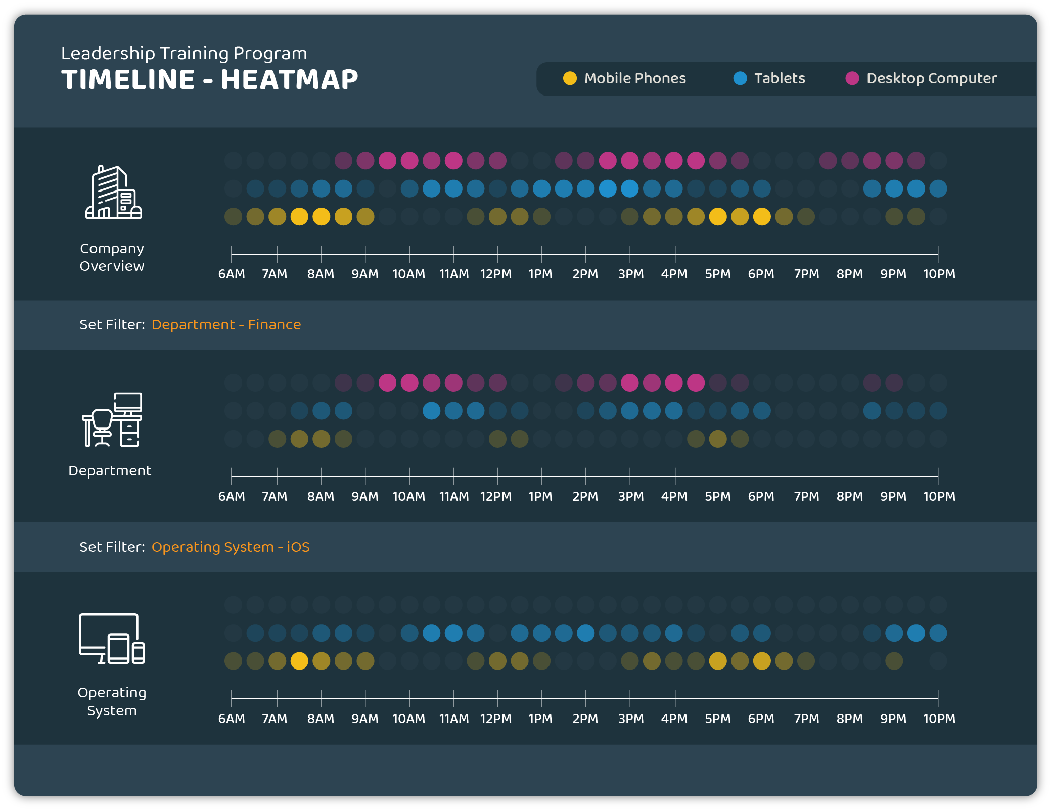
Timeline Heat Map
With elearning, your learners are no longer confined to a classroom. Training can be engaged with anywhere, and at any time of day. As a manager, it is helpful to know when and how your learners are engaging with your learning, both to optimise your content to your learners needs and to help support them in ways that best work for their personal situation. A timeline-based heatmap shows when and how your learners are engaging with their learning, illustrating which locations and platforms are most active at each time.
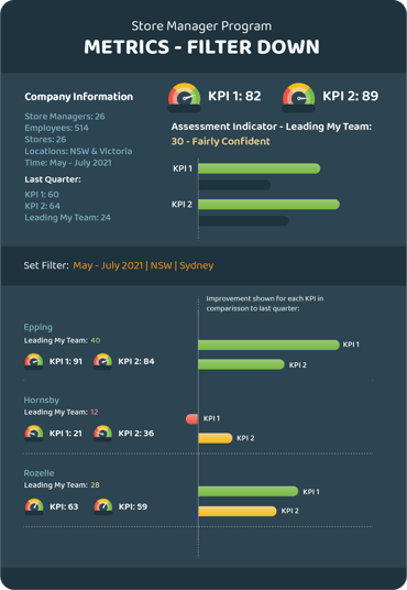
KPI performance tracking
The aim of any learning program is to improve the learner’s skills in the areas that are important to them and to your organisation. Tracking performance based on the KPIs that are most relevant lets you see the impact that your learning program will have on real-world outcomes. This visualisation combines confidence tracking, KPI measurements and performance over time, bringing together several sets of data to create a clear indicator of how well differing organisational teams are tracking against your targets and providing a detailed basis for discussions with your learners.
Clear learning data means better support for your learners and better outcomes for your learning. Our series on learning in the flow of data will continue on the Guroo blog in the coming weeks- if you have thoughts or questions on how your organisation can make use of its learning data, then get in touch with us today!