
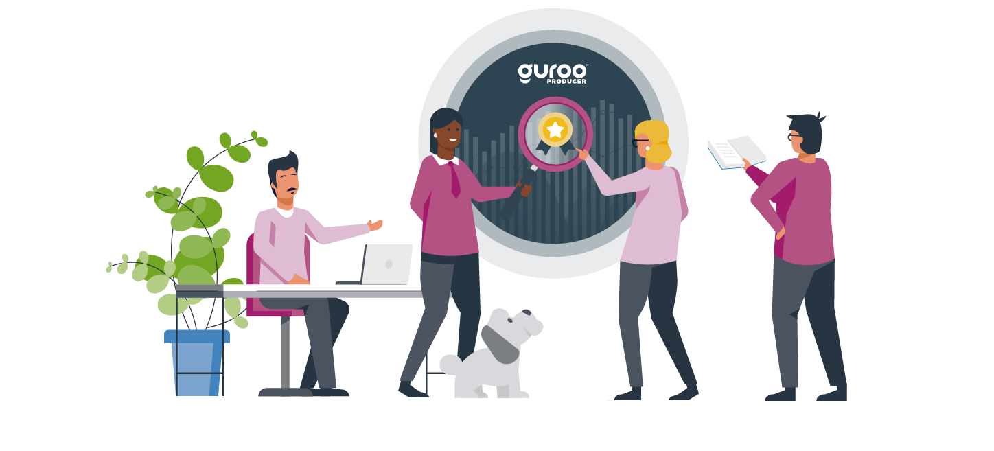
.png)

Good data can be invaluable to learning development. The right data can help you to discover what is and isn’t working in your learning, identify the skills and needs of your learners, create material that is more tailored to their needs, and ensure that you are achieving the outcomes that you need to meet your business’ goals. But to do all that data has to be timely, relevant and, most of all, understandable.
How can you achieve that with your data? Though we don’t often think about it, we regularly make use of powerful, versatile data visualisations in our day to day life. At Guroo, we investigated how some of those visualisations could be used to show information on learning in a simple and effective way. In this blog, we look at our results and discuss how eight examples could be used to display critical learning information.
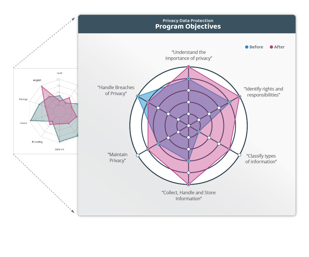
Spider Graph
How is it often used?
To show overall performance across a range of variables, such as measuring customer satisfaction, business effectiveness or student performance.
How would you use it in learning?
The spider graph can be used to track and measure a learner’s difference in self-assessment before and after they undertake a unit of learning.
What question does it answer?
The graph is used to display the impact that training has had on the learner, showing the difference in their confidence and self-assessed competence before and after the learning. This can be used to demonstrate the effectiveness of the learning from the learner’s perspective, and can form a basis for discussion between learners and managers at the completion of the program.
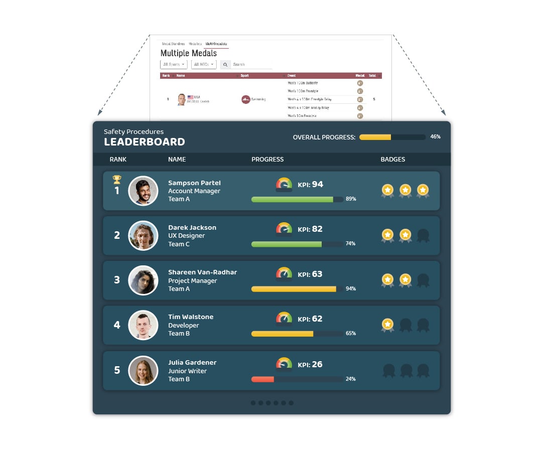
Leaderboard
How is it often used?
To show the relative performance of companies, athletes or competitors.
How would you use it in learning?
A leaderboard can be used to show the engagement and achievements of multiple students undertaking the same course or group of courses, ranking their progress and achievements.
What question does it answer?
Shows a ranking of how well each learner is performing within their cohort, providing learners and facilitators with an overview of the progress of the cohort and encouraging learners to engage with their learning to increase their individual rank.
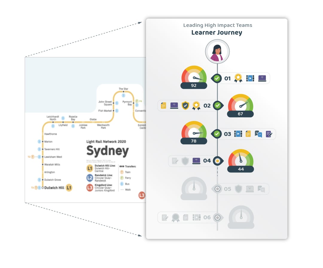
Journey Map
How is it often used?
To represent the route and stages of a journey.
How would you use it in learning?
A journey map can be utilised to communicate the learners journey though the course, showing their progress on each unit, amount of learning left to complete, and any badges or microcredentials they have achieved.
What question does it answer?
Having a clearly illustrated map of the program helps the learner understand how much time the learning journey will take, what they have achieved and whether they are on track, allowing them to better understand how much they much they need to do each day to complete their course on time.
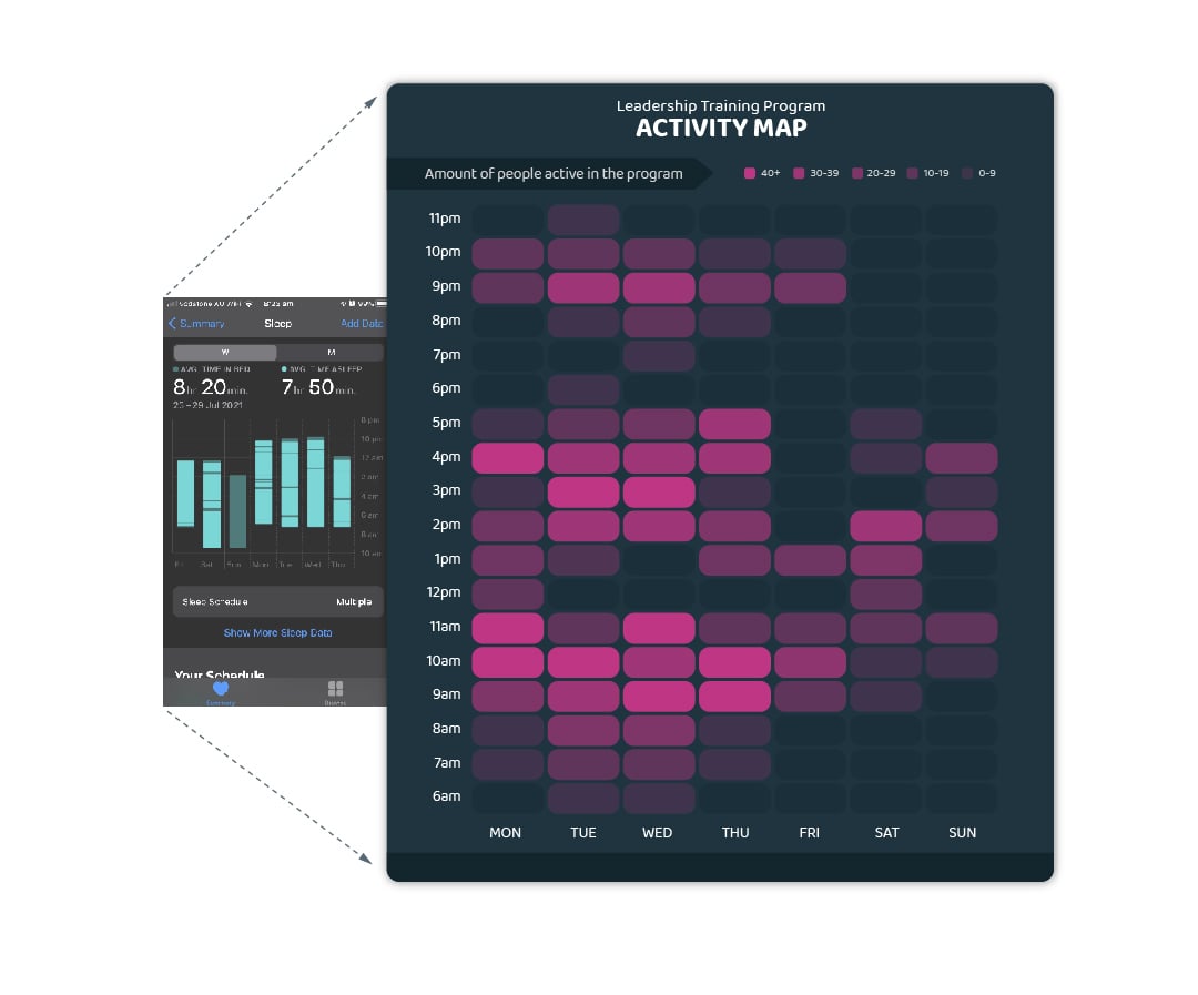
Time Heatmap
How is it often used?
To track when and for how long a user carries out an action, such as work, sleep or exercise.
How would you use it in learning?
To create a heat-map of when and for how long learners are accessing each component of their learning.
What question does it answer?
The heat map helps to visualise how much time learners spend on their learning, including a breakdown of what the time is spent on. This makes it easy to tell if learners are learning during or outside work hours, what portion of their time is spent on onboarding, and how long is spent on completing a module or task.
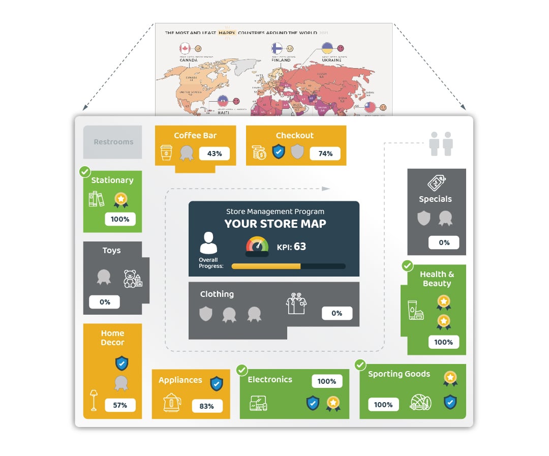
Choropleth Map
How is it often used?
As a colour-coded map to show attributes for different countries or areas, such as overall happiness, average temperature or virus cases.
How would you use it for learning?
As a real-time representation of a learner’s progress through their program, with the map taking a relevant shape for the program and each map section representing progress in a different module or subject.
What question does it answer?
The map represents how much progress the learner has made in each area as a percentage and colour, linking course content to clear real-world outcomes in the form of workplace competencies. Badges representing achievements and microcredentials can similarly be linked with work outcomes, populating the relevant area on the map once earned.
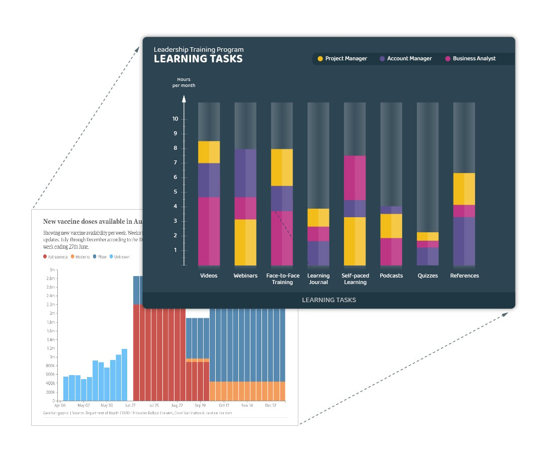
Stacked Bar Graph
How is it often used?
To represent proportions of a value over time, such as vaccine availability, time spent on differing activities or access to a site by user profiles.
How would you use it for learning?
A stacked bar graph can be used to visualise how differing learner profiles have interacted with their learning over time, and how each profile spends their time within the course.
What question does it answer?
The graph shows the ways that different cohorts of learners interact with their learning, helping to identify how each group applies their time. This gives an overview of what elements of a course are working well, and which might represent pain points for each cohort, highlighting areas for attention and improvement.
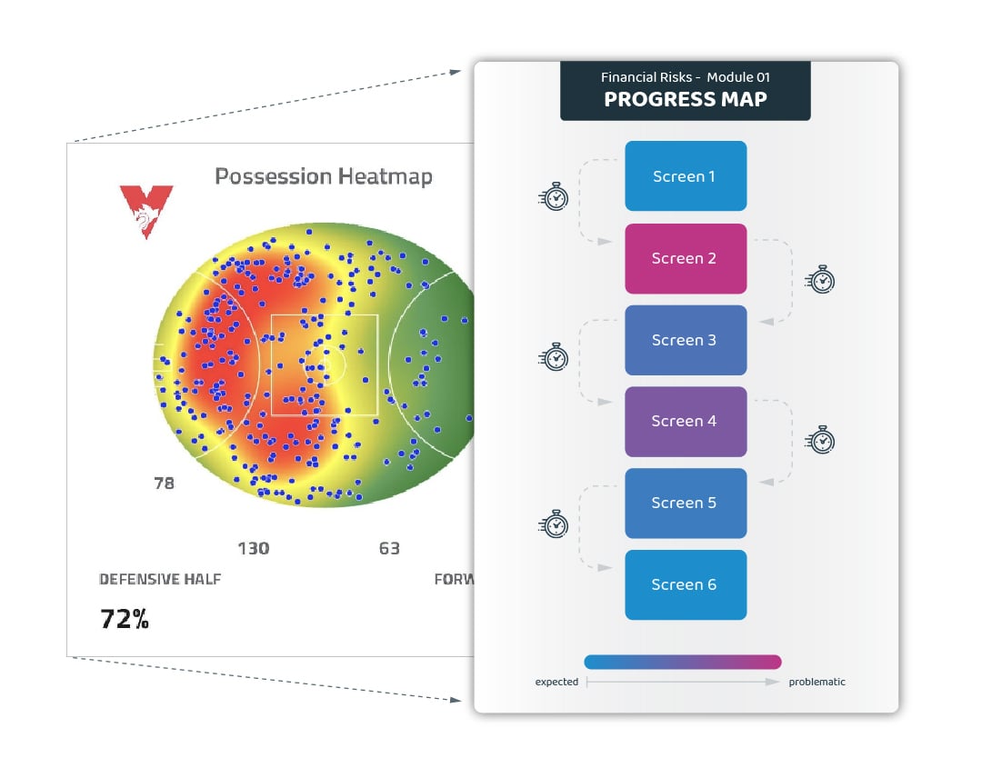
Progress Heatmap
How is it often used?
To show activity in an area over time, such as during a sports match, for traffic flow or for commuter activity.
How would you use it for learning?
The heat map can be used to visualise a module as a whole and the time taken to complete it, showing where learners linger for longer, either as an overview of the whole cohort, or focused down to individual learners
What question does it answer?
The heat map illustrates the learner’s journey through each module and identifies problem areas that are causing learners to become stuck or screens that are unnecessarily content heavy, identifying areas where learning can be redeveloped to reduce friction and improve learner’s comprehension.
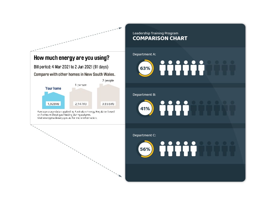
Comparison Chart
How is it often used?
To show a comparison between the user’s activity and other groups, such as income, travel or power consumption.
How would you use it in learning?
To display the amount of training completed and the overall score for that training for learner cohorts, in comparison to other teams within their department and other teams across the organization at large.
What question does it answer?
The comparison can be used to show a manager’s team is progressing with their learning is in comparison to the other departments and the organization, showcasing outstanding effort or alerting managers for the need for improvement.
Guroo is working to find ways to make better use of leaning data and create the outcomes your organization needs. If you would like to find out more, keep an eye on our blog over the coming weeks, or get in touch with us here – we’d love to discuss what we can do for you!